End Point Expansion
David L. ZellmerDepartment of Chemistry
California State University, Fresno
March 7, 2000
Evaluation of the end point volume by the "eyeball" method requires that you can read the volume axis (X-axis) of your graph to the nearest 0.1 mL or better. The overall graph of your titration curve does not let you do this.
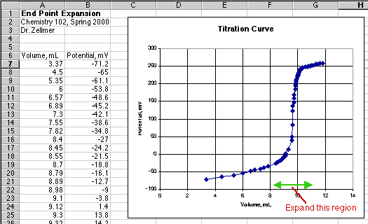
 At best you could guess the end point volume to the nearest 0.2 mL from the graph above. To expand the end point region, double-click on the X-axis line. (In Excel 98 for the Macintosh, a little box pops up to tell you when the cursor arrow is just touching the line.) This will bring up the Format Axis dialog box.
 Select the Scale tab from the Format Axis dialog box.
(Note that if you want to change the tick marks on this axis, the Patterns tab shown is where you would do it.)
 In the Scale tab, choose the Minimum and Maximum values for the milliliter region in which you expect to find the end point. I chose 9 mL for my Minimum and 10.6 mL for my Maximum.
Next set the Major unit to place the tick marks and gridlines to a size you can easily read. With 0.1 chosen, I will have a grid line every 0.1 mL.
The Minor unit tick marks were set to 0.02 mL, but since the Minor tick marks were not turned on in the Patterns tab, these will not be seen.
 Here is the expanded graph. These real student data points* show a few glitches in the end point region. This is quite normal in a potentiometric end point.
Drawing a circle around the possible mid-point of the curve shows that the probable end point starts at around 9.6 mL and is over by around 9.8 mL.
So our "eyeball estimate" would be 9.7 plus or minus 0.1 mL. The quality of the data does not permit reading to the nearest 0.01 mL as we might prefer on a regular color change end point.
With more stable readings in the end point region, we might want to do a further expansion of the scale to read to the nearest 0.01 mL.
Other things you should do when "eyeballing" a graph is to make the graph physically bigger. Use an entire screen to display it, or use a whole sheet of paper to print it out. Set the tick marks and grid lines to allow easy measurements of the volumes.
Just a final note on the graphs shown. In the original graph of the data, the X-axis came at the "0" point on the Y-axis. I double-clicked on the Y-axis and on the Scale tab changed the Y-axis intercept from "0" to "-100" to put the X-axis at the bottom of the graph. Another thing that could be done on the Y-axis is to expand it around the end point region investigated.
Excel has a huge number of ways to reformat your graphs. Try playing around with them to see what they do.
*My thanks to Gary Atashkarian and Shorin Nemeth from Chem 102 for taking these data.
--end--